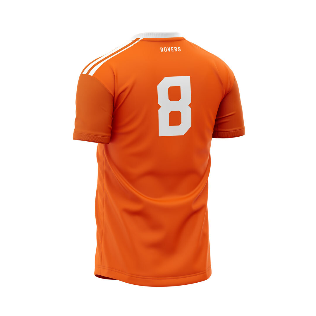
Rovers FC
Energizing an historic, local football club with an updated, social-forward identity.
Role: Designer
Challenge
Revitalize a team with a sense of community.
Impact
A renewed sense of purpose clarified the club’s philosophy in recruitment, training, playing together and celebrating together.
Outcome
A contemporary football identity built around camaraderie through football, fans can’t help but fall in love with.
What does playing football mean when you’re over thirty?
That was the question the storied Rovers FC, an East Bay, CA-based club, sought to answer in refreshing its logo and team identity. Eric Vacca wanted to reimagine team he had inherited as a club that valued winning a cup final in equal weight to the pint shared afterward. Camaraderie and competition. Ferocity and fun.
Rovers FC was formed in Berkeley, CA in 1972 by British ex-pats. Over the years the club played in leagues around the Bay Area, but maintained its roots in the East Bay.
From the off, the formation of this football club was motivated by the desire to get together with your mates as much as it was by a desire to win trophies.
In 2020, as much as things changed they stayed the same. The composition of the team had become noticeably more diverse, but the shared appreciation for being part of something with your friends remained at the core.
So it was with this essential purpose that we set out to refresh the identity with a simple system that emphasized on-and-off-field versatility.
Rover’s heritage orange formed the first building block for its vibrancy and long time association with the club. A classic-yet-contemporary logo and type system based on Hitchroute Sans lends itself to remixing into various shapes and combinations for use on jerseys, scarfs, and hats.
“Pride. That’s what I feel when my family turns up for games wearing Rovers FC gear.”
Football’s always been more than a game. It brings folks from around the world together through the joy and genius of play. Rovers FC reminds us to appreciate the time we spend together on our way to winning medals.


